DeFi Yield Aggregator & Risk Visualizer App
-
How might we design a mobile application that aggregates the highest yields across multiple blockchain protocols, while simultaneously translating complex, abstract risks (like impermanent loss and smart contract vulnerability) into a single, intuitive, and trustworthy metric for new and intermediate investors?
-
The Discovery phase was focused on competitive benchmarking and user empathy to clarify the information architecture needed to build trust.
A. Competitive Analysis
We benchmarked three types of financial products: traditional brokerage apps (for clean data presentation and security cues), crypto exchanges (for trading views), and existing DeFi aggregators (for feature comparison).
B. User Research & Personas
We identified two core personas, highlighting their different needs for risk presentation:
Persona 1: The Curious Novice (Jane, 28):
Goal: Earn more than her savings account.
Pain Point: Confused by acronyms (APY vs. APR) and terrified of "losing everything" due to a mistake.
Need: Simple, standardized risk rating and educational tooltips.
Persona 2: The Intermediate Trader (Alex, 35):
Goal: Optimize capital deployment across chains.
Pain Point: Time wasted checking audit reports and cross-referencing yields manually.
Need: Detailed breakdown of risk factors and advanced filtering.
C. Key User Flow Mapping
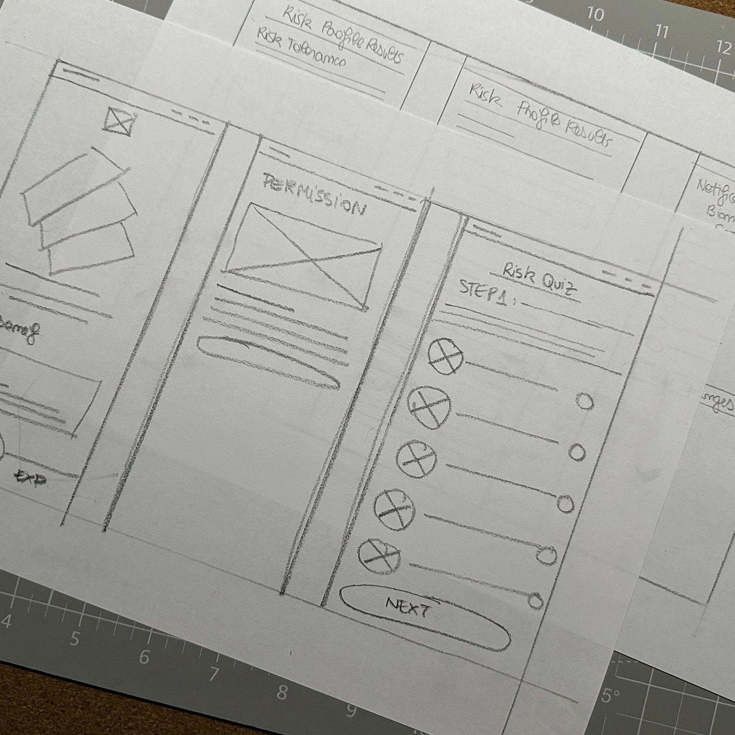
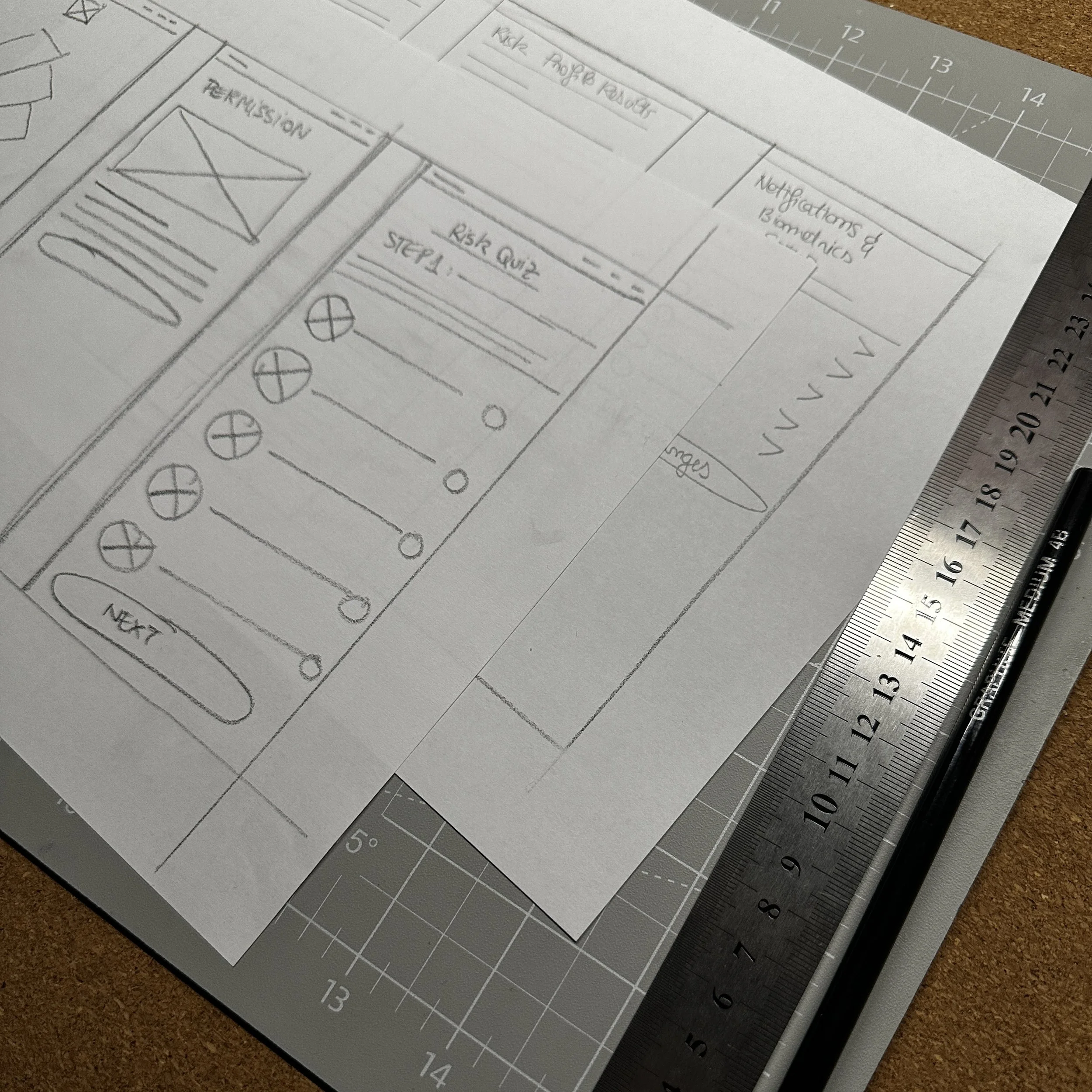
We mapped the critical path for a novice user: Risk Assessment → Find Strategy → Deposit Funds. This flow became the focus of the design effort, ensuring every step includes necessary education and reassurance.
-
Our design focused on three core solutions to demystify DeFi and build user confidence.
A. The YieldMax Risk Score (The Core Innovation)
To solve the opacity of risk, we introduced the YieldMax Risk Score, a composite index (1 to 100) combining three weighted factors:
Protocol Stability: Based on TVL, age, and security audits.
Asset Volatility: Based on the tokens used (stablecoin pools score lower).
Strategy Complexity: Simple lending strategies score lower than complex leveraged strategies.
Design Execution: This score is visually presented as a color-coded meter (Green/Low, Yellow/Moderate, Red/High) on both the Explore screen list and the Vault Detail screen. This allows for quick, scannable risk assessment.
B. The Transparent Transaction Flow
We redesigned the high-anxiety Deposit/Withdraw flow using clear feedback loops:
Plain Language Microcopy: Replacing "Sign Transaction" with "Approve YieldMax to deposit 100 USDC into Strategy X."
Gas Fee Prediction: Providing an estimated transaction completion time and the fee in both Gwei and USD equivalent, along with a warning if the network is congested.
The Reversibility Guardrail: For all irreversible actions, a mandatory confirmation overlay requires the user to manually type "CONFIRM" to proceed, ensuring intentionality.
C. Scalable Information Architecture
The application was built with a mobile-first philosophy, using a clean, dark-mode component library suitable for high-contrast data display.
Primary Navigation: A persistent bottom bar with four unambiguous sections: Portfolio, Explore, History, Settings.
Information Density: Utilized expandable card views and contextual tooltips (e.g., hovering over "APY" explains how it differs from "APR") to manage data density without overwhelming the Novice user.
-
The final output of this design project included a comprehensive set of artifacts demonstrating the end-to-end UX process.
High-Fidelity Mobile Prototypes
Fully interactive prototype for the Wallet Connection, Risk Assessment Quiz, and Deposit Flow.
Demonstrates visual design skill and interaction design.
Information Architecture Map
Sitemap and detailed user flows for the Risk Assessment and Strategy Search funnels.
Shows strategic thinking and ability to organize complex data.
Design System & Component Library
Documentation for core components (Risk Meter, Custom Charts, Transaction Confirmation Modals), color palette, and typography (utilizing the brand color #4E3CDB).
Proves ability to design at scale and prepare for developer handoff.
Risk Visualization Mockups
Detailed visual designs of the Vault Detail Screen, showing the Risk Score, performance chart, and protocol stability metrics.
Focuses on the unique product value proposition and data visualization expertise.
Usability Testing Report
A summary of findings from low-fidelity tests, specifically around the clarity of the "Risk Score" and the Deposit/Transaction flow.
Validates design decisions with user feedback, showcasing research rigor.


